We offer two different ways to display customer reviews. Beginning January 1, 2026, the new review display layout has officially been applied across all stores. While both versions show review images and content, they differ significantly in layout and user experience.
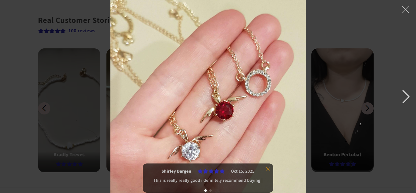
In the previous version, the review image is shown in a full-screen overlay, with the review text, rating, and reviewer name displayed as a floating card on top of the image, usually at the bottom. The product page remains visible in the background.
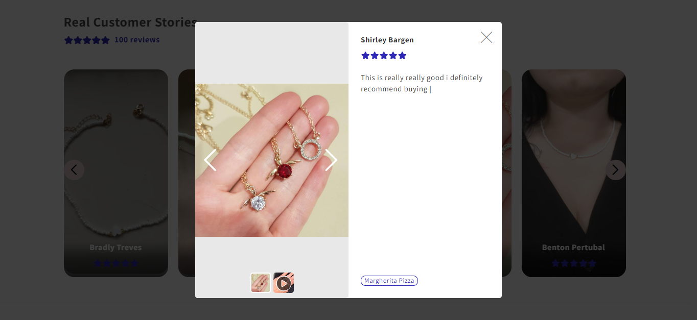
In the current version, the review opens in a centered modal window. The review image is displayed on the left, while the reviewer name, star rating, and review text are clearly separated and shown on the right.
Previous Version | Current Version | |
Layout | Full-screen image with review overlaid | Modal layout with image and review separated |
Readability | Depends on the image background | Clear and easy to read |
Focus | Product page remains distracting | Background dimmed, focused on review |
Review visibility | Review content is less prominent | Review details are clearly highlighted |
Long reviews | Limited display space | More space for longer content |
Overall experience | Basic and less structured | Cleaner and more polished |
While the previous version focuses heavily on visual impact, the current version provides a more balanced, readable, and user-friendly review experience. By improving layout structure, clarity, and focus, the new display helps shoppers better understand customer feedback and feel more confident in their purchase decisions.